library(tidyverse)
palmerpenguins <- read.csv('https://justsharan.xyz/stats/datasets/palmerpenguins.csv')1 Intro to plotting with ggplot2
ggplot2 is a powerful plotting utility which is part of the tidyverse collection of R packages, and it provides a really useful interface for building plots. It is automatically imported when you import the tidyverse package mentioned in the preface.
I’ll explain how to make basic plots with it using the palmerpenguins.csv data, which provides information on various body measurements for 3 species of penguins from 3 different islands, grouped by sex. It is a useful dataset which is often used when teaching statistics and data science.
1.1 Importing and examining data
First, we can load the package and import our dataset.
We can examine what the data looks like using the head() method, which returns the first few rows of the tibble. Optionally, you can also use View(palmerpenguins) to open the tibble in a new window, if you’re using a tool like RStudio or VS Code.
head(palmerpenguins)| species | island | culmen_length_mm | culmen_depth_mm | flipper_length_mm | body_mass_g | sex |
|---|---|---|---|---|---|---|
| Adelie | Torgersen | 39.1 | 18.7 | 181 | 3750 | Male |
| Adelie | Torgersen | 39.5 | 17.4 | 186 | 3800 | Female |
| Adelie | Torgersen | 40.3 | 18.0 | 195 | 3250 | Female |
| Adelie | Torgersen | 36.7 | 19.3 | 193 | 3450 | Female |
| Adelie | Torgersen | 39.3 | 20.6 | 190 | 3650 | Male |
| Adelie | Torgersen | 38.9 | 17.8 | 181 | 3625 | Female |
1.2 Basic plotting
Any ggplot visualization starts with this command: ggplot(data), where data is the dataframe or tibble to visualize. After this, we can use the + operator to add layers to our plot, which correspond to additional visualizations. For example, we can form a scatter plot with culmen_depth_mm on the \(x\)-axis and culmen_length_mm on the \(y\)-axis as such:
ggplot(palmerpenguins) +
  geom_point(aes(x = culmen_depth_mm, y = culmen_length_mm))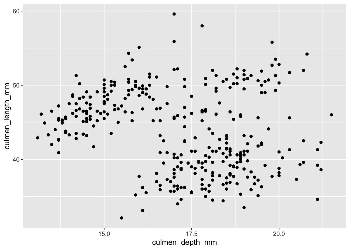
ggplot()allows us to specify the dataset to use.+tells R: ‘don’t plot yet! I have more information about how to make this plot’geom_pointtells R that we want to plot pointsaes()stands for aesthetic mappings. We will useaeswhenever we want to specify a piece of information that changes with each point. For example, the \(x\) and \(y\) position of each datapoint changes with each point (duh). So, they go inside theaesmethod.
We can also specify other properties that change with each point, such as the color and shape. If we wanted to color each data point by the species that the point represents, we can specify it inside aes(). If we want to change the shape of the data points, we can do that with the shape property.
ggplot(palmerpenguins) +
  geom_point(
    aes(x = culmen_depth_mm, y = culmen_length_mm, color = species),
    shape = 17
  )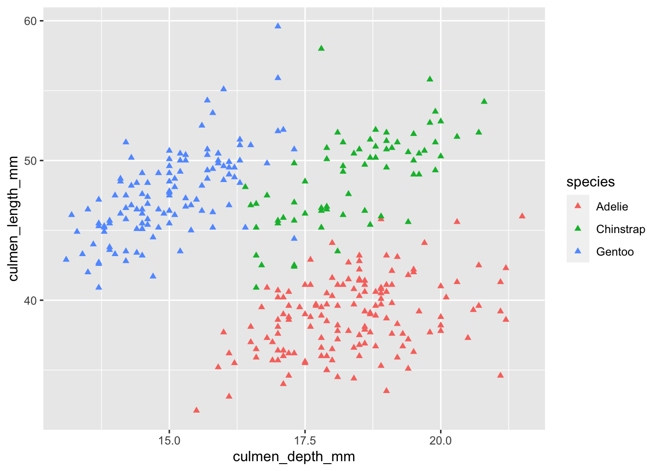
Notice how I placed color inside the aes() method, but shape remained outside.
colorwas set inside the mappings, meaning the color differed between each data point depending on what the species was.shapewas set outside the mappings, meaning we wanted all data points to get that property regardless of any characteristics about them.
1.3 Adding labels
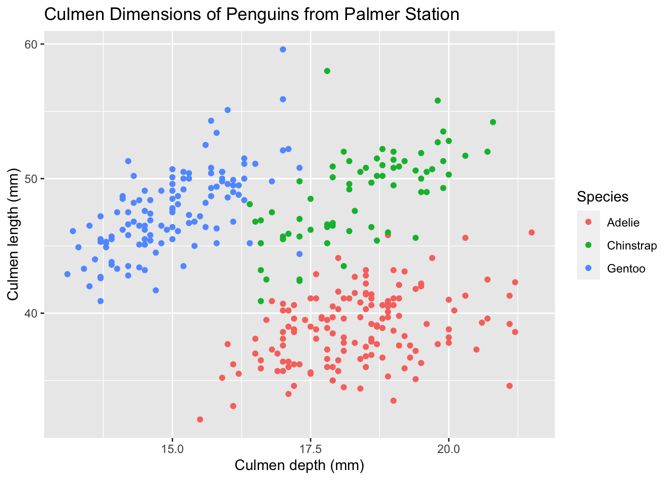
Right now, our plot looks unhelpful, since there’s no title, and axes names just refer to the names of the columns in our tibble. Can we change that? Of course.
ggplot(palmerpenguins, aes(x = culmen_depth_mm, y = culmen_length_mm, color = species)) +
  geom_point() +
  labs(
    title = 'Culmen Dimensions of Penguins from Palmer Station',
    x = 'Culmen depth (mm)',
    y = 'Culmen length (mm)',
    color = 'Species'
  )
From here onwards, I’ll store the labs layer in a variable called tutorial_labs and import it in, instead of typing it out each time.
Notice that this time, I placed aes() in the ggplot method and not within the geom_point layer. If you put the aesthetic mappings in the main ggplot method, then all layers will inherit those mappings. If we had another layer after the scatterplot (let’s say I added linear regression lines), then they would also inherit those mappings. If you only have one layer, it doesn’t matter which method the aesthetic mappings are specified under.
1.4 Facets
Right now, our single plot shows data from all the different islands. If we wanted to show three separate plots for penguins from each island, the naïve solution might be to filter by location first and then plot each one of them individually.
palmerpenguins %>%
  # Do this for each island type
  filter(island == 'Biscoe') %>%
  ggplot(aes(x = culmen_depth_mm, culmen_length_mm, color = species)) +
    geom_point() +
    # I'm importing all of tutorial_labs,
    # and then overwriting the title using labs()
    tutorial_labs +
    labs(title = 'Culmen Dimensions for Penguins from Biscoe Islands')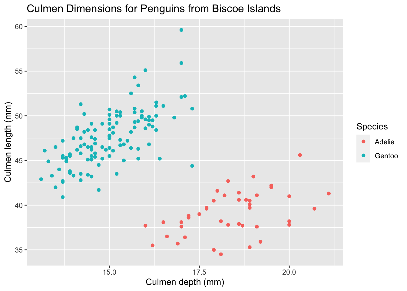
However, ggplot provides a much easier solution for this issue, and it is called facets. Facets allow you to split your data by a category (or two categories) first, and then plot each subset of your data separately. To plot each island’s data as a separate scatterplot, we could do this:
ggplot(palmerpenguins) +
  geom_point(aes(x = culmen_depth_mm, y = culmen_length_mm, color = species)) +
  facet_wrap(~ island) +
  tutorial_labs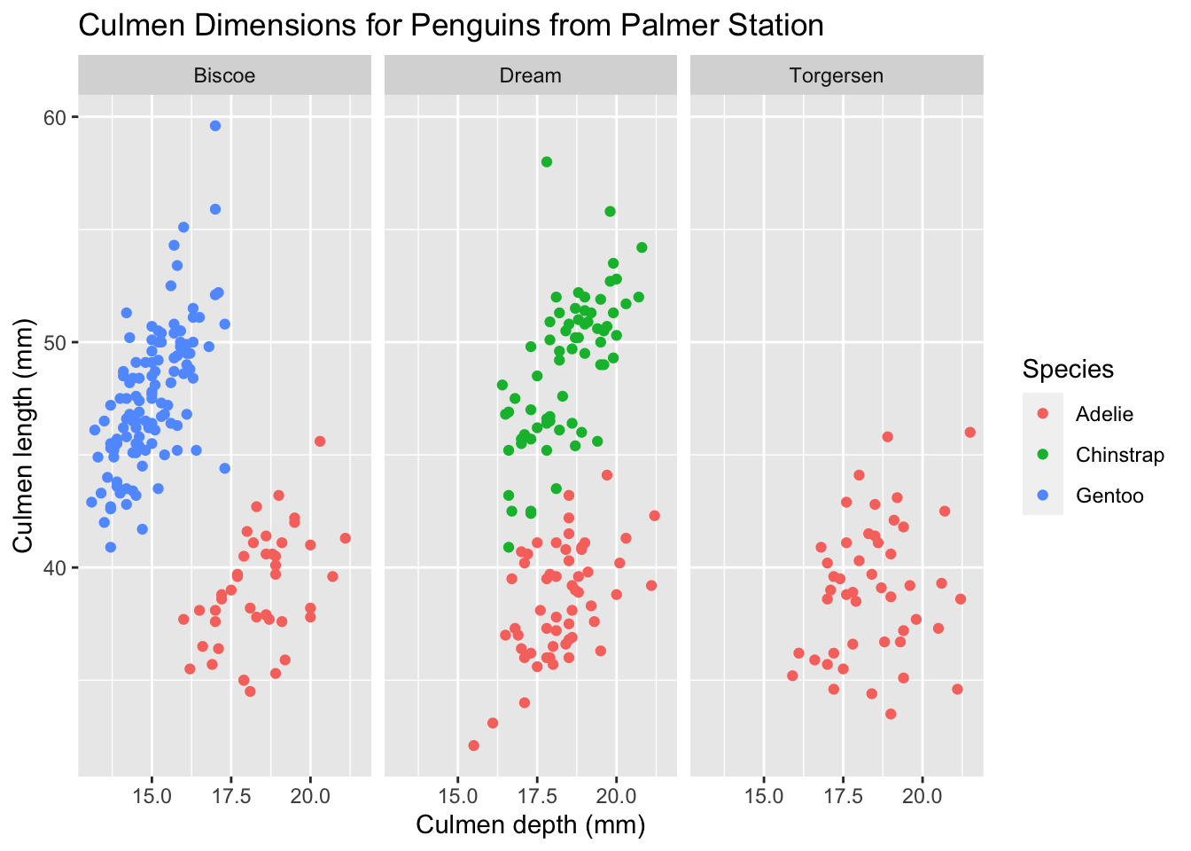
What if we wanted to split by two categories? We’d like to see a separate graph for each island-species combination. When we want to facet by more than one category, we can use the facet_grid layer. Here’s how that works:
ggplot(palmerpenguins) +
  geom_point(aes(x = culmen_depth_mm, y = culmen_length_mm), size = 0.8) +
  facet_grid(species ~ island) +
  tutorial_labs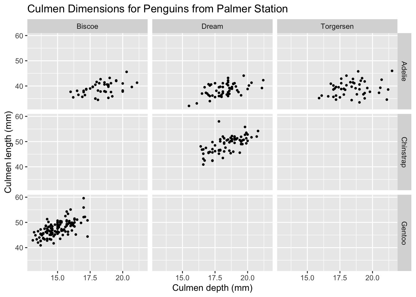
I’ve also made two changes:
- Removed the coloring of data points, since we have separate plots for each species.
- Lowered the size of each data point using the
sizeproperty. Notice how this size property is outside the aesthetic mappings, since we’d like to change the size of all data points, irrespective of what data it represents.
1.5 Adding layers
As mentioned earlier, we can add additional layers on top of our existing plot to convey additional information. For a visualization comparing two quantitative variables, it makes sense to include a trendline. We can use that using the geom_smooth method. Let’s look at Gentoo penguins alone.
palmerpenguins %>%
  filter(species == 'Gentoo') %>%
  ggplot(aes(x = culmen_depth_mm, y = culmen_length_mm)) +
    # First layer
    geom_point() +
    # Second layer
    geom_smooth(method=lm) +
    # Pulling in old labels and changing the title
    tutorial_labs +
    labs(title = 'Culmen Dimensions for Gentoo Penguins')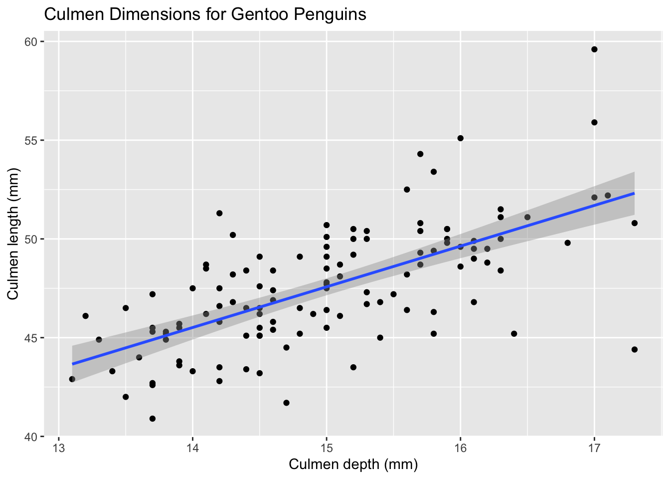
1.6 Additional themes
ggplot also allows you to change the visual aesthetic of your graph using themes. There are a few built-in themes that you could use:
base.graph <- ggplot(palmerpenguins) +
  geom_point(aes(x = culmen_depth_mm, y = culmen_length_mm, color = species))

# Light theme
base.graph + theme_light()

# Minimal theme
base.graph + theme_minimal()

# Classic theme
base.graph + theme_classic()

# Black and white theme
base.graph + theme_bw()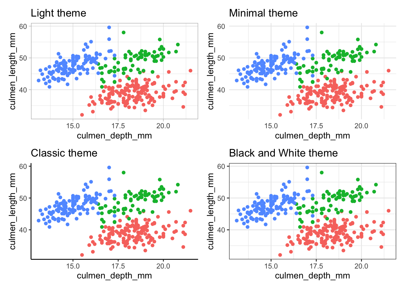
Notice that the black and white theme only affects the background visuals, and the colors you specified in the aesthetic mappings are retained. If you’d like to produce a truly black and white graph, you’ll need to use a different way to distinguish between species, such as shape.
Since we’re using shape now, we’ll have to specify the title for the legend again (the previous one was called color since it was the title for the color legend).
ggplot(palmerpenguins) +
  geom_point(aes(x = culmen_depth_mm, y = culmen_length_mm, shape = species)) +
  tutorial_labs +
  labs(shape = 'Species') +
  theme_bw()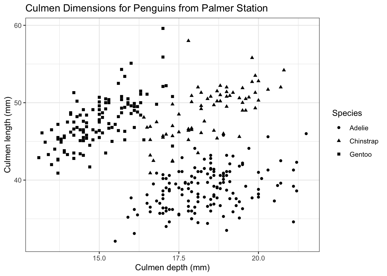
You can also create your own themes or import external themes. There is an excellent package called ggthemes which provides a ton of useful themes and color palettes, which you can browse here.
One of my favorites is the fivethirtyeight theme, which mimics the design of the FiveThirtyEight website. It functions the same as built-in ggplot2 themes. I’m also changing the color palette as shown.
ggthemes functions overwrite your axis titles, so you’ll need to revert them back to our defaults as shown in this example.
library(ggthemes)
ggplot(palmerpenguins) +
  geom_point(aes(x = culmen_depth_mm, y = culmen_length_mm, color = species)) +
  labs(
    title = 'Culmen Dimensions for Palmer Station Penguins',
    subtitle = 'Culmen length and depth for Adelie, Chinstrap, and Gentoo penguins',
    x = 'Culmen depth (mm)',
    y = 'Culmen length (mm)',
    color = 'Species'
  ) +
  theme_fivethirtyeight() +
  scale_color_brewer(palette = 'Set2') +
  # Reset axis titles
  theme(axis.title = element_text())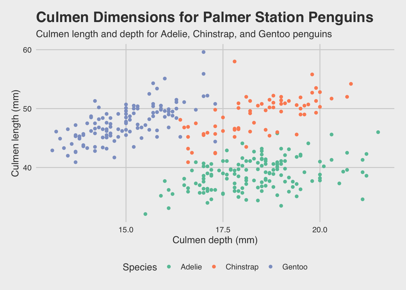
That’s looking pretty good.
This section of the site is inspired by these two sources: