| mpg | cyl | disp | hp | drat | wt | qsec | vs | am | gear | carb | |
|---|---|---|---|---|---|---|---|---|---|---|---|
| Mazda RX4 | 21.0 | 6 | 160 | 110 | 3.90 | 2.620 | 16.46 | 0 | 1 | 4 | 4 |
| Mazda RX4 Wag | 21.0 | 6 | 160 | 110 | 3.90 | 2.875 | 17.02 | 0 | 1 | 4 | 4 |
| Datsun 710 | 22.8 | 4 | 108 | 93 | 3.85 | 2.320 | 18.61 | 1 | 1 | 4 | 1 |
| Hornet 4 Drive | 21.4 | 6 | 258 | 110 | 3.08 | 3.215 | 19.44 | 1 | 0 | 3 | 1 |
| Hornet Sportabout | 18.7 | 8 | 360 | 175 | 3.15 | 3.440 | 17.02 | 0 | 0 | 3 | 2 |
| Valiant | 18.1 | 6 | 225 | 105 | 2.76 | 3.460 | 20.22 | 1 | 0 | 3 | 1 |
3 Presenting multiple variables
3.1 Two quantitative variables
For this portion of the page, we’ll be looking at the mtcars dataset, which has quantitative information on various cars. It is built into R and does not need to be imported. More information about the source of the data and the meaning of the variables can be found at this page. We can use head() or View() to explore the dataset and see what columns are in the data.
head(mtcars)3.1.1 Scatterplot
The most common way to present associations between two quantitative variables is by using a scatterplot. It can be made using the geom_point layer in ggplot as such:
ggplot(mtcars, aes(x = wt, y = mpg)) +
  geom_point() +
  labs(
    x = 'Weight (thousands of lbs)',
    y = 'Fuel Efficiency (miles/U.S. gallon)'
  )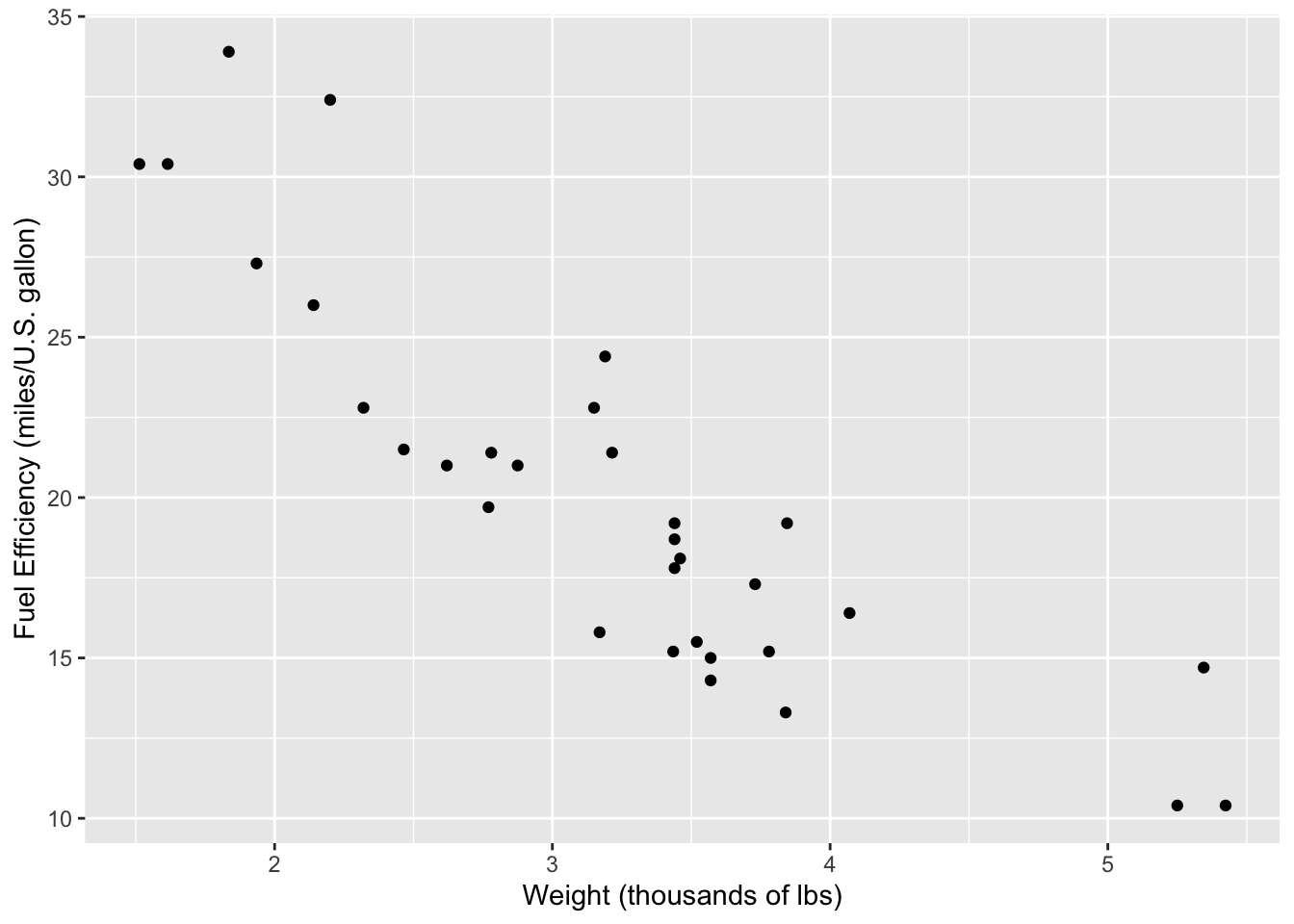
When describing a scatterplot, these are the main things to look for:
- Direction: Is the association positive or negative? Does the response variable increase as the explanatory variable increases (positive) or does it decrease (negative)?
- Form: Is the association linear or non-linear? Is there a different relationship at play?
- Strength: Is the association strong, moderate, or weak?
3.1.2 Correlation matrix
While presenting relationships between two numerical variables, it’s also common to include the correlation coefficient. This will be explained in detail in a later section as well. It can be conducted using the cor.test function in R:
cor.test(mtcars$wt, mtcars$mpg)
    Pearson's product-moment correlation

data:  mtcars$wt and mtcars$mpg
t = -9.559, df = 30, p-value = 1.294e-10
alternative hypothesis: true correlation is not equal to 0
95 percent confidence interval:
 -0.9338264 -0.7440872
sample estimates:
       cor
-0.8676594
The magnitude of the correlation coefficient can range from 0 to 1 and conveys the strength of the correlation. The closer the magnitude is to 1, the stronger the association between the two variables. The sign on the coefficient conveys the direction; a positive \(r\) value indicates a positive association, while a negative \(r\) value indicates a negative association.
If we were interested in analyzing the relationships between all possible combinations of variables within a dataframe, we can do that in R and present the result in the form of a heatmap.
mtcars %>%
  cor() %>%
  data.frame() %>%
  mutate(var1 = rownames(.)) %>%
  gather(var2, corr, -var1) %>%
  ggplot(aes(x = var1, y = var2, fill = corr)) +
  geom_tile() +
  scale_fill_gradient2(low = 'blue', high = 'red', mid = 'white', limit = c(-1, 1), midpoint = 0) +
  labs(x = 'Variable 1', y = 'Variable 2', fill = 'Pearson\nCorrelation')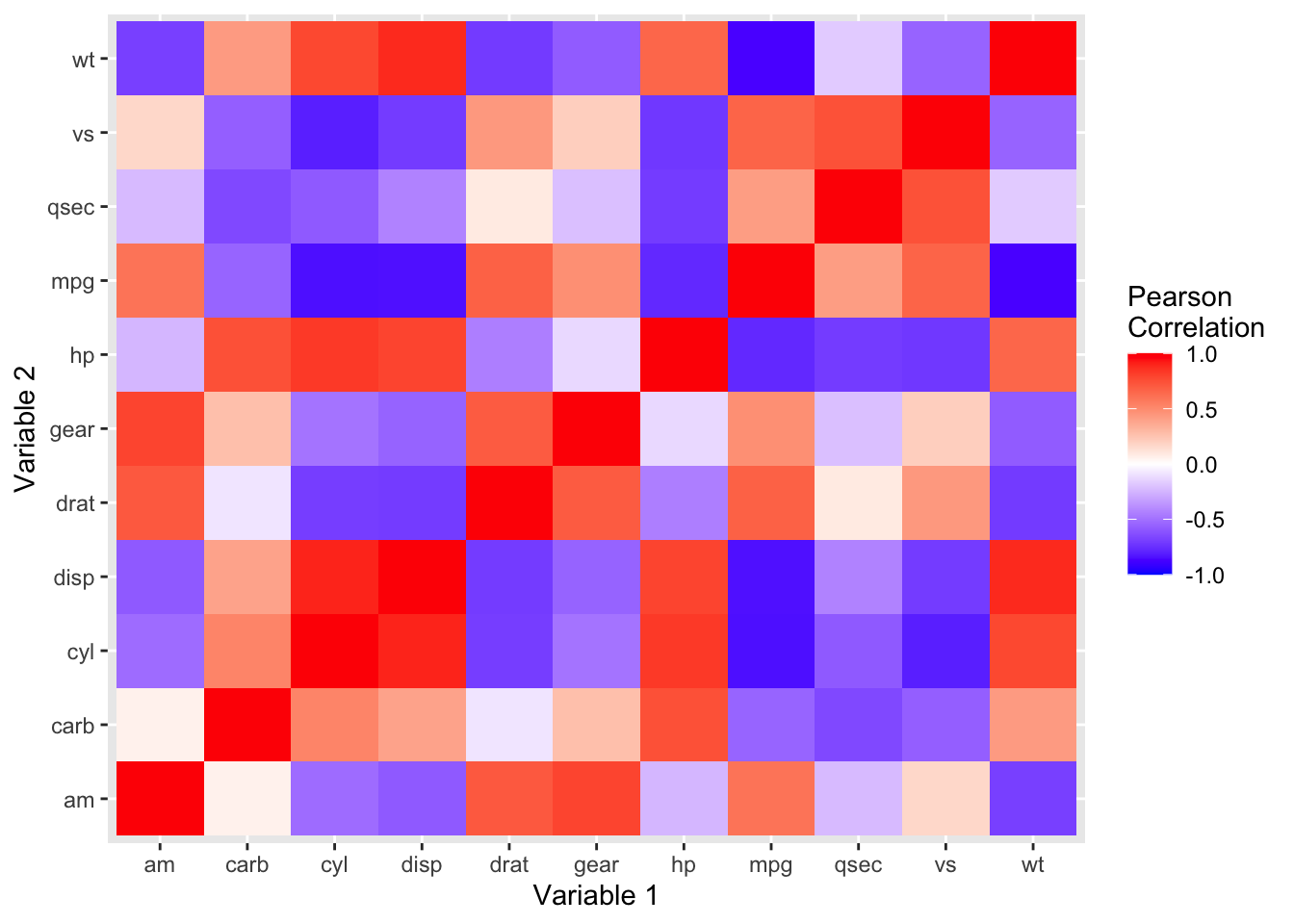
Here’s everything in the code, broken down:
cor()computes the correlation between every pair of columns in the dataset. The result is a dataset with all the original columns in the column and row of the dataset, with each cell representing the correlation between that pair of data.data.frame()creates a data frame out of this information.mutate()is needed as the rows are in the index of the data frame, and we’re making them a column in the dataset.gather()converts the data from wide to long format. The original columns which were included as columns in ourcor()dataframe are now converted to long format, with the other column names stored insidevar2. This makes it easier for ggplot to plot it.ggplot()takes in the melted dataframe and our aesthetic mappings. We want the \(x\)-axis to contain our first variable, the \(y\)-axis to contain our second variable, and we want the fills of each pair to correspond to the correlation between those two variables.geom_tile()is the layer we need to produce the tile design we’re looking for.scale_fill_gradient2()creates a color gradient with a value for the low, middle, and high ends of the distribution.labs()sets our axis and legend titles.
3.2 Two categorical variables
For this section, we’ll look at the titanic.csv, which contains information about all the passengers on the titanic. We can use head() or View() to explore the dataset and see what columns are in the data.
head(titanic)| Survived | Pclass | Name | Sex | Age | Siblings/Spouses Aboard | Parents/Children Aboard | Fare |
|---|---|---|---|---|---|---|---|
| 0 | 3 | Mr. Owen Harris Braund | male | 22 | 1 | 0 | 7.2500 |
| 1 | 1 | Mrs. John Bradley (Florence Briggs Thayer) Cumings | female | 38 | 1 | 0 | 71.2833 |
| 1 | 3 | Miss. Laina Heikkinen | female | 26 | 0 | 0 | 7.9250 |
| 1 | 1 | Mrs. Jacques Heath (Lily May Peel) Futrelle | female | 35 | 1 | 0 | 53.1000 |
| 0 | 3 | Mr. William Henry Allen | male | 35 | 0 | 0 | 8.0500 |
| 0 | 3 | Mr. James Moran | male | 27 | 0 | 0 | 8.4583 |
We’re interested in looking at relationships between the sex (male/female) and their survival. We can convert the Survived column to a boolean type as such:
titanic <- mutate(titanic,
  Survived = ifelse(Survived == 1, 'Survived', 'Died'),
  Sex = ifelse(Sex == 'male', 'Male', 'Female'))
This codeblock iterates through each row of titanic and sets the Survived column to the value of Survived == 1. That expression checks if the variable is equal to 1, and returns 'Survived' if it’s equal and 'Died' if it’s not equal. It also checks if the Sex == 'male' and returns 'Male' or 'Female' depending on the result (this is used to return capitalized text rather than the existing lowercase ones).
3.2.1 Contingency table
The first and most straightforward way to visualize this data is by using a contingency table. R provides a built-in function to do this.
titanic.table <- table(titanic$Survived, titanic$Sex) %>%
  addmargins()
kable(titanic.table)| Female | Male | Sum | |
|---|---|---|---|
| Died | 81 | 464 | 545 |
| Survived | 233 | 109 | 342 |
| Sum | 314 | 573 | 887 |
3.2.2 Bar chart
One way to graphically visualize such data is by using a grouped bar graph:
titanic %>%
  count(Survived, Sex) %>%
  ggplot(aes(x = Survived, y = n, fill = Sex)) +
    geom_bar(stat = 'identity', position = position_dodge()) +
    labs(y = 'Number of Passengers')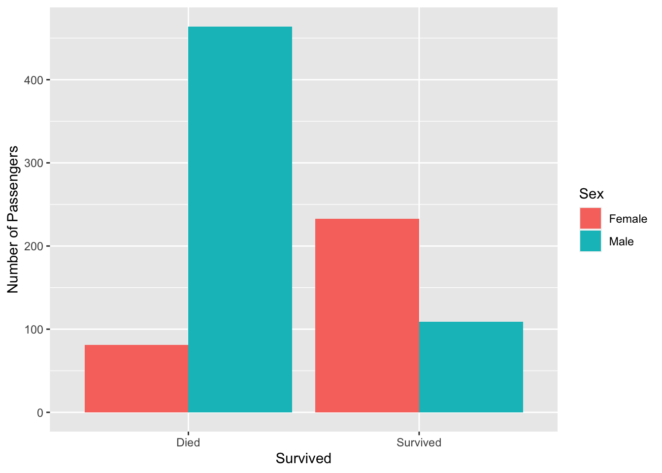
In this code, we first group the titanic dataset by survival status and sex, and then pipe it to ggplot. Once ggplot has our data frame, we pass in aesthetic mappings to place the survival status on the \(x\)-axis, frequency on the \(y\)-axis, and fill it with the Sex variable (different colors based on gender).
To the geom_bar layer, we specify a position parameter with a value of position_dodge(), which places each fill on its own line, creating a grouped bar graph (rather than a stacked bar graph). Finally, we change the \(y\)-axis label.
3.2.3 Mosaic plot
An alternative way to present the same data is by using a mosaic plot. A mosaic plot displays the relative frequencies of all the pairs of categorical variables.
titanic %>%
  count(Survived, Sex) %>%
  group_by(Survived) %>%
  mutate(rel_freq = n/sum(n)) %>%
  ggplot(aes(x = Survived, y = rel_freq, fill = Sex)) +
    geom_bar(stat = 'identity') +
    labs(y = 'Relative Frequency')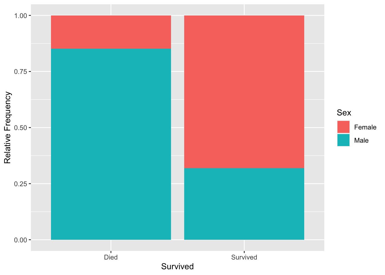
A mosaic plot is helpful in determining what proportion of individuals from each group (Survived or Died) were from each gender, unlike a bar chart, which solely shows the frequencies.
3.3 A quantitative and a categorical variable
For this section, we’ll look at the iris dataset, which includes information on physical dimensions of three plant species. It is built into R and does not need to be imported. We can use head() or View() to explore the dataset and see what columns are in the data.
head(iris)| Sepal.Length | Sepal.Width | Petal.Length | Petal.Width | Species |
|---|---|---|---|---|
| 5.1 | 3.5 | 1.4 | 0.2 | setosa |
| 4.9 | 3.0 | 1.4 | 0.2 | setosa |
| 4.7 | 3.2 | 1.3 | 0.2 | setosa |
| 4.6 | 3.1 | 1.5 | 0.2 | setosa |
| 5.0 | 3.6 | 1.4 | 0.2 | setosa |
| 5.4 | 3.9 | 1.7 | 0.4 | setosa |
3.3.1 Boxplots
One way to visualize such data is by using multiple boxplots side-by-side. We can use this to look at the variation in petal length among the three species.
ggplot(iris, aes(x = Species, y = Sepal.Length)) +
  geom_boxplot() +
  labs(x = 'Species', y = 'Petal Length (cm)')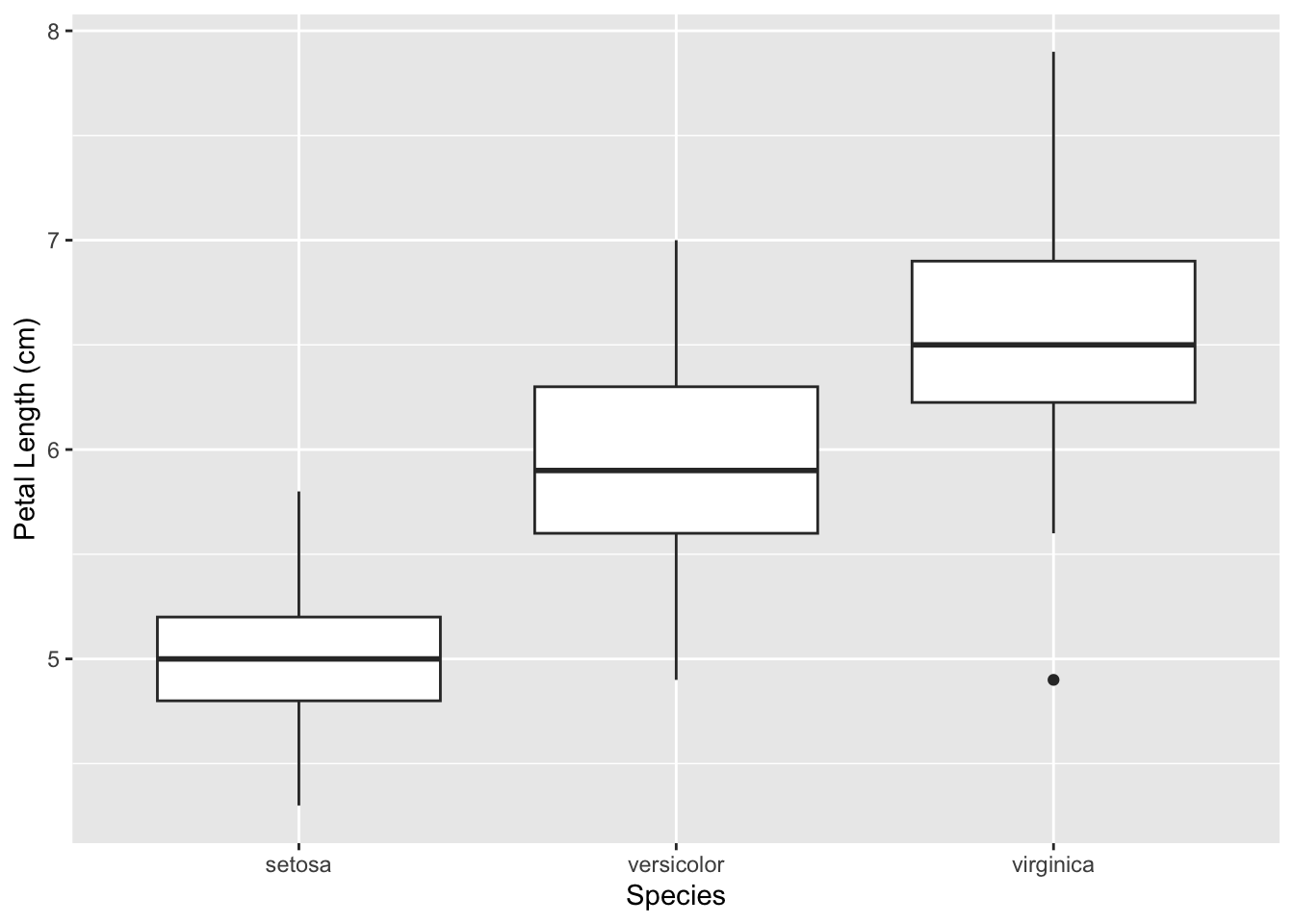
3.3.2 Stripcharts and violin plots
There’s another similar plot that we could construct with this data called a violin plot. While a boxplot is useful for understanding the general distribution of our data (comparing medians, quartiles, etc, among groups), a violin plot produces a more detailed way to visualize the distribution of our variable.
ggplot(iris, aes(x = Species, y = Sepal.Length)) +
  geom_violin() +
  labs(x = 'Species', y = 'Petal Length (cm)')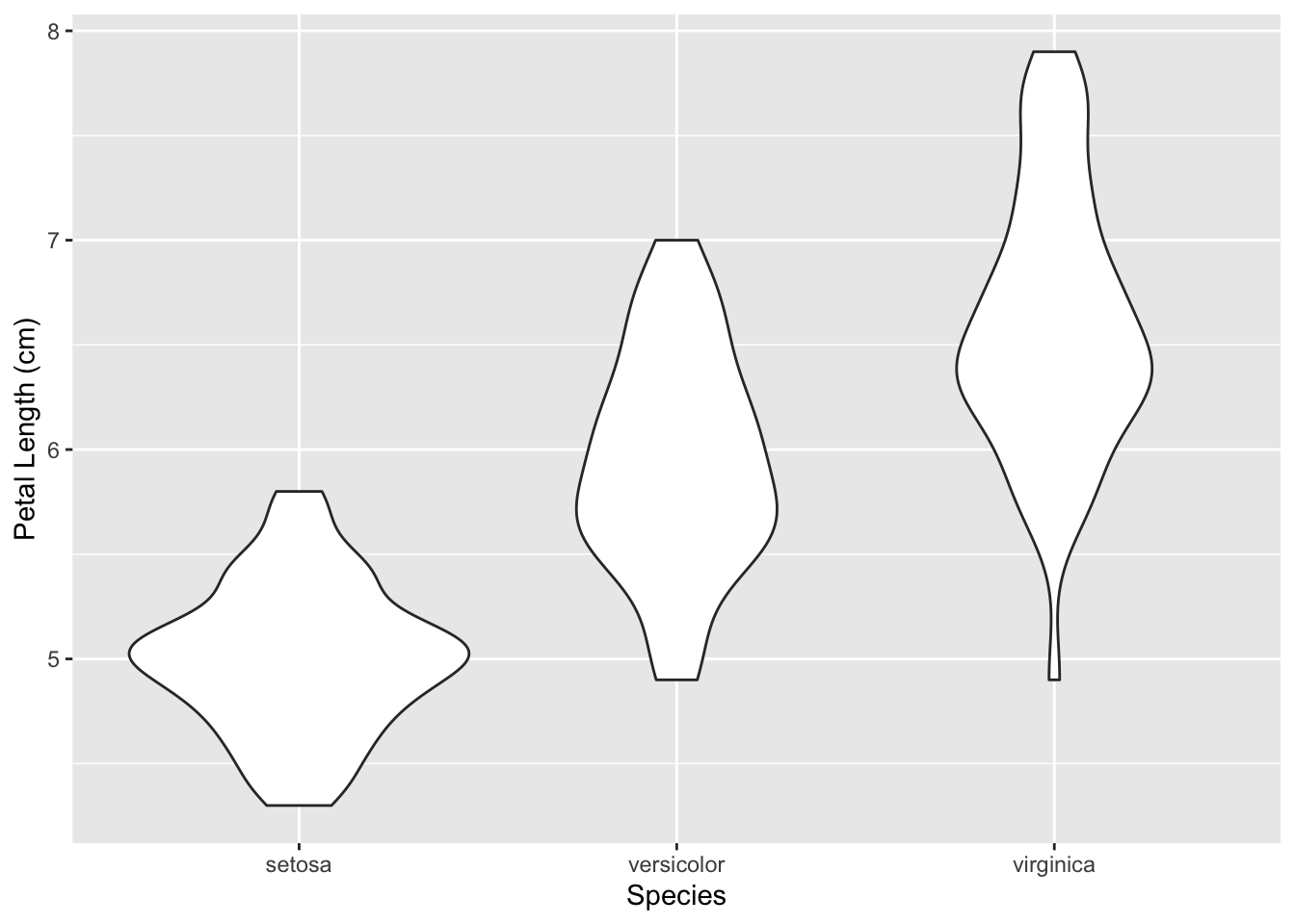
While our violin plots have the same heights as the boxplots, the width of a violin plot at any given petal length value represents the frequency of that value in the distribution.
Often times, a stripchart is laid on top of the violin plot as well.
ggplot(iris, aes(x = Species, y = Sepal.Length)) +
  geom_violin() +
  geom_jitter(size = 2, shape = 1, width = 0.1) +
  labs(x = 'Species', y = 'Petal Length (cm)')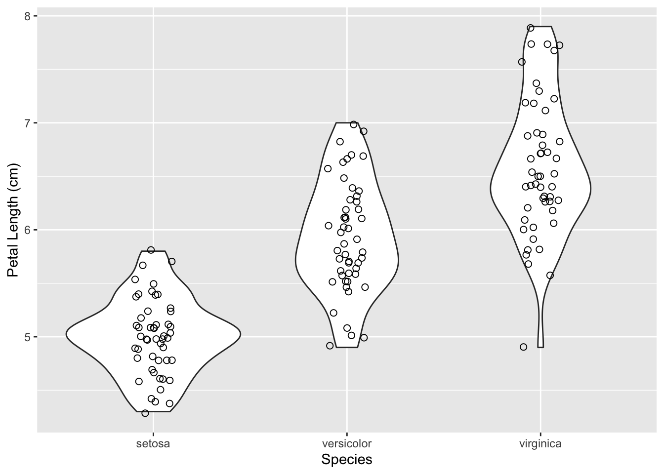
geom_jitter() does the same task as geom_point(); it plots points. However, it adds a small amount of random variation to the location of each point, and this helps us better see overlapping data points. The positions are given a random shift each time the function is ran, so you may view a slightly different graph each time you render it.
The width value that was passed in controls the width of the “frame” in which all the jittered points lie, with a maximum of 1. So a width value of 0.1 crams all the points into the middle 10% of the available space for the points. We use this option in the example above to fit all the points into the violin plot. Try removing the width parameter and see how the graph changes.
3.3.3 Histograms and kernel density plots
The final method to visualize this type of data is to use a histogram. But aren’t histograms used to visualize one variable at a time? Yes, but we could either facet our data or use different colors to view the distribution of multiple variables at once. You can do the latter as such:
ggplot(iris, aes(x = Petal.Length, fill = Species)) +
  geom_histogram(alpha = 0.7, bins = 30) +
  labs(x = 'Petal Length (cm)', y = 'Frequency', fill = 'Species')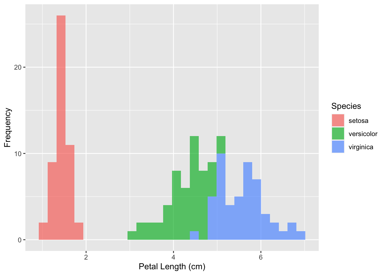
Unlike the previous histogram example, I’ve added two parameters here, which are purely just used for aesthetic purposes:
alphasets the opacity of the fill as a percent, with 1 being fully opaque.binssets the number of bins for the histogram.
You can view the full list of customization options for each command in the documentation by running ?<command name> in the R console. For the histogram method, you can run ?geom_histogram and view a list of all the parameters that you can use.
A different plot that is very similar to a histogram is called a kernel density plot. A kernel density plot also displays the distribution of a continunous variable, but presents it in the form of a smoothened curve rather than using bins. It can be made as follows:
ggplot(iris, aes(x = Petal.Length, fill = Species)) +
  geom_density(alpha = 0.7) +
  labs(x = 'Petal Length (cm)', y = 'Density', fill = 'Species')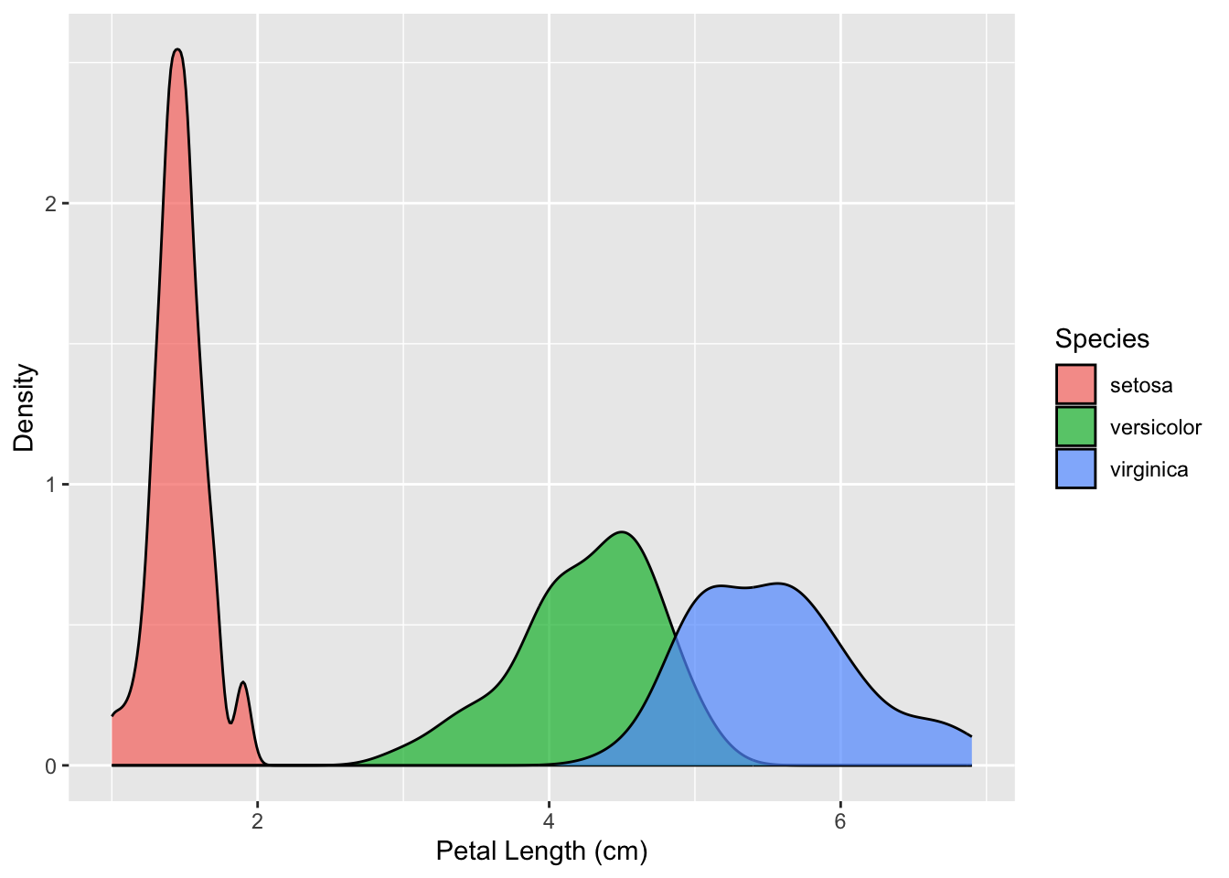
A kernel density plot is also better at showing the parts of your data that overlap. In the histogram, we couldn’t tell how tall the versicolor (green) bins got, as they were fully covered by the virginica (blue) bins. In the kernel density plot, however, it is easier to spot the overlap.