| fixed.acidity | volatile.acidity | citric.acid | residual.sugar | chlorides | free.sulfur.dioxide | total.sulfur.dioxide | density | pH | sulphates | alcohol | quality |
|---|---|---|---|---|---|---|---|---|---|---|---|
| 7.0 | 0.27 | 0.36 | 20.7 | 0.045 | 45 | 170 | 1.0010 | 3.00 | 0.45 | 8.8 | 6 |
| 6.3 | 0.30 | 0.34 | 1.6 | 0.049 | 14 | 132 | 0.9940 | 3.30 | 0.49 | 9.5 | 6 |
| 8.1 | 0.28 | 0.40 | 6.9 | 0.050 | 30 | 97 | 0.9951 | 3.26 | 0.44 | 10.1 | 6 |
| 7.2 | 0.23 | 0.32 | 8.5 | 0.058 | 47 | 186 | 0.9956 | 3.19 | 0.40 | 9.9 | 6 |
| 7.2 | 0.23 | 0.32 | 8.5 | 0.058 | 47 | 186 | 0.9956 | 3.19 | 0.40 | 9.9 | 6 |
| 8.1 | 0.28 | 0.40 | 6.9 | 0.050 | 30 | 97 | 0.9951 | 3.26 | 0.44 | 10.1 | 6 |
2 Presenting a single variable
2.1 Quantative variables
For this demonstration, I’ll be using white wine data from the wine quality dataset from the UCI Machine Learning repository, accessible at winequality-white.csv. It contains information related to red and white wine samples from northern Portugal, and the study aimed to model wine quality based on the chemical properties of the wines.
2.1.1 Exploring the dataset
We don’t always know what our data looks like. It is usually a good idea to explore it using head() or View(). Here, we can see the columns present in the winequality dataset.
head(winequality.white)2.1.2 Histograms and boxplots
There are plenty of ways to visualize a single quantitative variable, but the two most common methods are using a histogram and a boxplot.
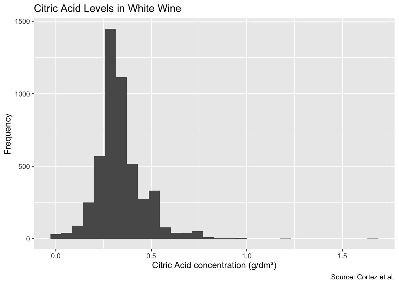
We can build a histogram using ggplot2, our plotting utility of choice. Let’s use it to visualize the distribution of citric acid concentration in white wines.
ggplot(winequality.white, aes(citric.acid)) +
  geom_histogram() +
  labs(
    title = 'Citric Acid Levels in White Wine',
    x = 'Citric Acid concentration (g/dm³)',
    y = 'Frequency',
    caption = 'Source: Cortez et al.'
  )
It looks like our dataset is roughly positively skewed, and has a few outliers to the right.
A boxplot, or a box-and-whisker plot, makes it easier to visualize outliers. We can draw them either vertically or horizontally by placing them on the \(x\) or \(y\)-axis within our aesthetic mappings.
ggplot(winequality.white, aes(x = citric.acid)) +
  geom_boxplot() +
  labs(
    title = 'Citric Acid Levels in White Wine',
    x = 'Citric Acid concentration (g/dm³)'
  )
Although individual variables aren’t typically presented in the form of a boxplot, it can be useful for looking at its distribution.
2.1.3 Cumulative frequency distributions
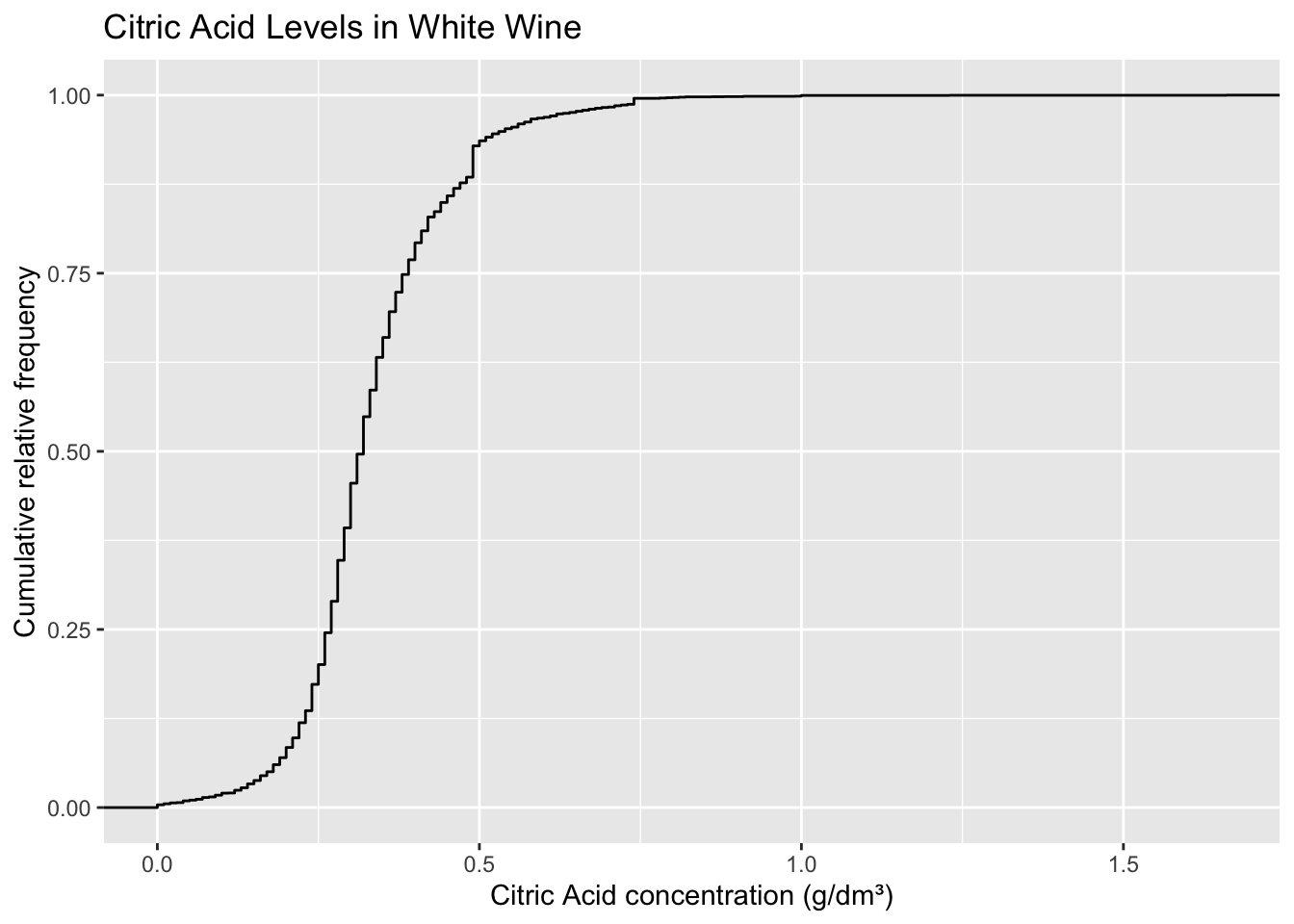
The median and quartiles are examples of percentiles/quantiles. A percentile is a measure of what percent of the dataset is below a value. In other words, the nth percentile of a distribution describes value below which n% of your dataset lies. We can visualize this using a cumulative frequency distribution.
ggplot(winequality.white, aes(citric.acid)) +
  stat_ecdf() +
  labs(
    title = 'Citric Acid Levels in White Wine',
    x = 'Citric Acid concentration (g/dm³)',
    y = 'Cumulative relative frequency'
  )
While a variable is rarely presented using a CDF plot, it can be a useful tool to gain a better understanding of your data. [TODO: Explain how to interpret CDFs]
2.2 Categorical variables
For this demonstration, I’ll be using the tv-shows.csv data, which contains information on the top-rated TV shows around the world from The Movie Database. You can import it using the read.csv() method as demonstrated in previous pages.
2.2.1 Exploring the dataset
As usual, we can use head() or View() to explore the dataset and see what columns are available to us.
head(tv.shows)| first_air_date | country | language | name | popularity | vote_average | vote_count |
|---|---|---|---|---|---|---|
| 2012-05-14 | Argentina | es | Violetta | 35.821 | 8.2 | 230 |
| 2004-03-15 | Argentina | es | Floricienta | 70.664 | 8.1 | 133 |
| 2015-01-13 | Argentina | es | Airport Security | 17.261 | 7.6 | 100 |
| 2002-05-27 | Argentina | es | Rebelde Way | 128.706 | 8.0 | 312 |
| 2021-10-29 | Argentina | es | Maradona, Blessed Dream | 56.841 | 7.5 | 613 |
| 2017-06-19 | Argentina | es | Once | 277.186 | 8.7 | 1181 |
We could use this data to visualize the number of top-rated TV shows from each country.
2.2.2 Relative frequency table
We can count the number of TV shows by country and present the relative frequency for each country, or what proportion of shows in the dataset are from that particular country. We’ll also cap the data to only show countries with at least 10 shows in the list.
tv.shows.table <- tv.shows %>%
  count(country, sort = TRUE) %>%
  filter(n >= 10) %>%
mutate(relative_frequency = n / sum(n))tv.shows.table| country | n | relative_frequency |
|---|---|---|
| United States | 1408 | 0.558 |
| Japan | 396 | 0.157 |
| United Kingdom | 179 | 0.071 |
| Mexico | 154 | 0.061 |
| Korea, Republic of | 98 | 0.039 |
| Canada | 65 | 0.026 |
| Colombia | 59 | 0.023 |
| Spain | 51 | 0.020 |
| France | 22 | 0.009 |
| Brazil | 21 | 0.008 |
| Turkey | 20 | 0.008 |
| Italy | 15 | 0.006 |
| Germany | 14 | 0.006 |
| Argentina | 13 | 0.005 |
| China | 10 | 0.004 |
2.2.3 Bar chart
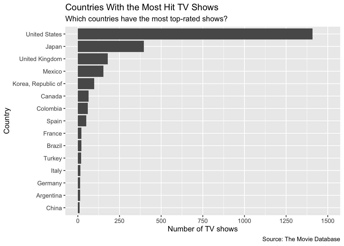
A bar chart is the preferred way to visualize univariate, categorical data such as the information above. Since we’ve already saved the relative frequency table to tv.shows.table, we’ll be able to use this dataframe in conjunction with ggplot to create a bar chart.
ggplot(tv.shows.table, aes(x = reorder(country, n), y = n)) +
  geom_bar(stat = 'identity') +
  labs(
    title = 'Countries With the Most Hit TV Shows',
    subtitle = 'Which countries have the most top-rated shows?',
    x = 'Country',
    y = 'Number of TV shows',
    caption = 'Source: The Movie Database'
  ) +
  coord_flip() +
  scale_y_continuous(limits = c(0, 1500), n.breaks = 7)